
Navigation & Findability
01. Overview
After the merger of Tufts Health Plan and Harvard Pilgrim, I undertook a pivotal role in improving the navigation experience across their portals and public websites. Initially identifying significant navigational challenges, I spearheaded efforts to research, redesign, and enhance usability and accessibility, aiming to align user needs with organizational goals.
I led the design efforts as the Design Lead, collaborating closely with contributors Casey Addy and Alex Escobedo, and supported by UX Researcher Matthew Pugsley. Together, we navigated the complexities of merging two distinct healthcare portals and refining the subsequent public-facing website over a three-month period in early 2024.
Team/Roles: Daniel Dodman (design lead), Casey Addy (contributor), Alex Escobedo (contributor) Matthew Pugsley (ux research),
Timeframe: Early 2024 (3 months)

02. Ideation
Our journey began with a comprehensive inventory and analysis of existing portal and public site structures. We conducted thorough assessments, including:
Analyzing site traffic and user behavior through analytics.
Conducting competitive research to benchmark industry standards.
Implementing card sorting and tree testing to optimize information architecture.
Addressing terminology mismatches between internal stakeholders and public perception.
Investigating the efficacy of site search functionalities and their alignment with user needs.
Navigating challenges such as internal resistance to change and regulatory constraints, we remained committed to enhancing accessibility, mobile responsiveness, and overall user experience.

Rigorous validation and testing were integral to our process:
Conducted tree testing to measure user proficiency in locating information.
Achieved a significant increase in findability metrics, with user success rates improving from a baseline of 27% to 88%.
Iterated designs based on five rounds of usability testing involving 50 users per round.
Received overwhelming user preference for the new unified design, emphasizing its simplicity and ease of use.
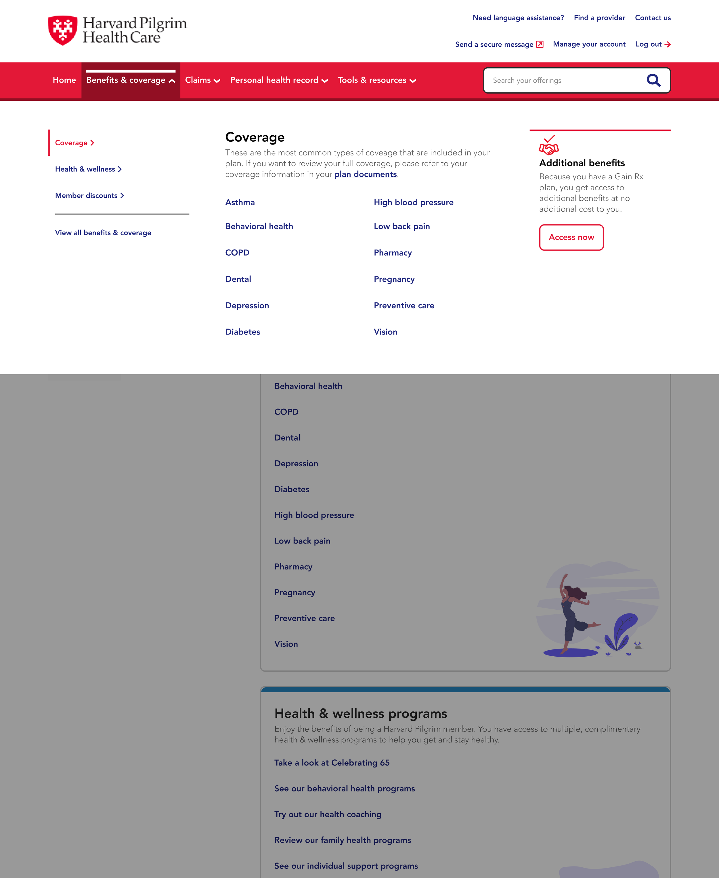
03. Design

04. Validation
Our design strategy prioritized clarity and simplicity while maintaining alignment with organizational goals:
Implemented a cohesive design system, refining elements and establishing usage guidelines.
Validated designs through extensive team feedback and usability testing.
Ensured alignment with broader organizational objectives, fostering a seamless user journey.
Streamlined navigation pathways to enhance information scent and guide users effectively.
Introduced a funnel approach to navigation, progressively directing users to relevant content with increased clarity.


05. Results
The project yielded substantial improvements in user experience and navigation efficiency:
Enhanced member portal navigation by 60%, significantly boosting user satisfaction and task completion rates.
Achieved visual consistency between the member portal and public website, fostering familiarity and ease of use for users.
Despite achieving these successes, resource constraints necessitated prioritization, leading to deferred tasks such as refining hub navigation and enhancing page content.
Navigating third-party development challenges highlighted the importance of transparent communication and collaboration across product, development, and UX teams. The project underscored the need for proactive project oversight to mitigate risks and ensure seamless implementation.
