
Registration & Onboarding
01. Overview
When I joined the Harvard Pilgrim side of Point32Health, I quickly identified critical pain points within the member portal. It was cumbersome to navigate, lacked key information, and featured an overly complex, arbitrary registration process without proper user onboarding.
To address these challenges, I conducted an in-depth review of the portal’s architecture, including the technology stack, regulatory requirements, and design objectives. I discovered that user experience had not been a priority, resulting in a disjointed and frustrating process for members.
I presented a series of strategic improvements to my director and team, aimed at simplifying registration, improving navigation, and introducing a thoughtful onboarding process. These changes, once implemented, not only streamlined the user journey but also increased user engagement and satisfaction by making the portal more intuitive and inviting.
Team/Roles: Daniel Dodman (lead UX/UI designer), Matthew Pugsley (lead user researcher), Casey Addy (strategist, contributer)
Timeframe: August 2023 (4 months total)


02. Ideation
First, we wanted understand why members registered for the portal, what services they utilized inside the portal, why they completed or abandoned the registration process, and why or why not they returned for the portal. Essentially, what was the member’s first time experience like and how did that effect their behavior moving forward.
We analyzed the current state, spoke with stakeholders, SMEs, our customer support staff, completed competitive analysis of other similar and dissimilar company’s processes for onboarding users on to their digital experiences, and studied the current analytics of the registration funnel.
We found a number of key issues:
the experience was too long, too many steps
the process of registration took users longer than expected to complete
the business was trying to collect a lot of information from users at one time (during registration) that had little to nothing to do with registration, onboarding, or welcoming users to our brand
there was a lack of a proper mobile app experience for users
the business wanted one solution to fit all plan types, but as we soon found out, personalizations needed to be made depending on the plan and/or user type (ex. medicare vs. commercial, subscriber vs. dependent)
From these findings, we began to iterate on a design solution that could meet member needs and business needs.


03. Design
We validated our new design theories with prospective members via UserTesting.com. We also shared the updated work with key stakeholders to ensure our business goals were being met as well.
Users preferred the new design because it felt more welcoming and assistive. They were told, concisely, why each piece of information was needed and this created a stronger bond and trust with Harvard Pilgrim as a brand.
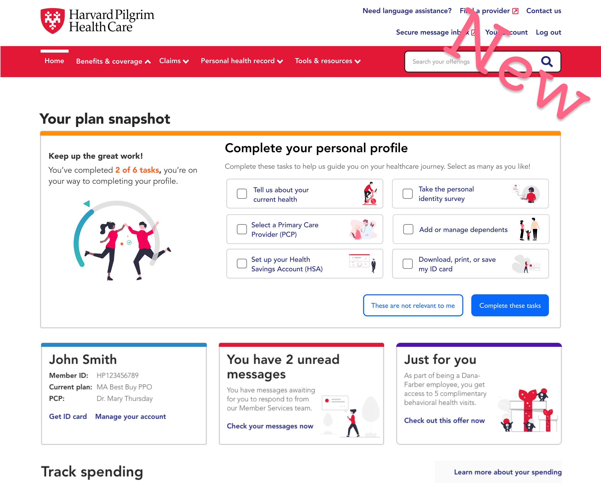
Users were generally registering for the portal to perform a specific task, such as: find a provider, view my ID cards, check on a recent claim, etc.. They did not want to first have to fill out extensive information about their health, prescriptions, etc. Due to that, users rated the new portal dashboard “personal profile” card a massive success. They could complete those things at a later time and grab their ID cards NOW. Incentives were recommended to entice users in to filling out this information, which was at present, only important to Harvard Pilgrim, and not the members themselves (although we would have wanted to change this as well, but that was another project).
We also noticed that members were flying through the process, unlike before. Completion times dropped from 15-20 minutes to a few minutes, while still preserving the information that the business needed.

04. Validation
Initial pain points based on our initial research:
reduce the number of steps
reduce time to completion
decrease cognitive load at one time
get folks in to the portal quickly
every step should have a value add (or removed, moved to another part of our process)
create an onboarding process that felt worthwhile and personalized
create a system for profile building that would not force users to do it the first time and would remind them of the needed information to complete at their convenience
From there, we began working. We were seeking to update the visual style, include more welcoming colors/graphics, minimize the length of the flow, and create brand new processes for onboarding and profile building.


05. Results
We made a number of improvements:
improved completion rate by close to 80% — from fractions of hours to mere minutes
reduced the registration process from 28 pages, to 4 short sections that could be filled out quickly
Set up a “user profile” section at the top of the homepage so that members would be reminded to complete these steps each time they logged in — this allowed users to fill out the necessary information (primarily for the business) as they had the time rather than all at once when a specific goal was their primary concern
created an onboarding process where there was none — this allowed users to explore areas of the site and plan perks that they may not have been aware of, in addition to improving portal navigation and overall member satisfaction
we could split up the 3 pieces of the design in terms of implementation - pieces of the process and their builds could be shifted between the three areas (registration, onboarding, & profile building)
was extensible to all three brands, and any future brands with minimal tweaks due to unified styling and newly created design system components — this helped to increase the ease, efficiency, and consistency of future project work
created many finished components for the unified design system
